
Friday, September 16, 2011
Friday, September 9, 2011

Wednesday, August 24, 2011

Wednesday, July 20, 2011
Africa in Perspective

As we all know, maps lie. As the United States has adopted the Mercator Projection as its standard in classrooms, many people have been falsly informed on the "true" sizes of our physical landscapes. The worst on the map being that Greenland is represented as being approximately the same size as Africa, when it fact is shares a square area closer to the size of Mexico.The map above really gives you a good idea of how large the continent of Africa really is.
Wednesday, July 13, 2011

Tuesday, July 12, 2011
LGTBI Rights Map - 2008

This is an interesting map I came across showing the progression for the rights of Lesbian, Gay, Transgendered, Bisexual and Intersex people's right. We can now add a red New York State to this map as well.
Monday, July 11, 2011


Saturday, July 9, 2011
World Transit System

If only traveling could be this easy...
This map follows Harry Beck's topological design and closely resembles the London Tube Map, Circle Line included. As with any Harry Beck-like map, this map is a representation of relativity. Don't take your geography lessons from this map! Most of these cities are fairly off from where they actually are.
Friday, July 8, 2011
The Hitchhiker's Map

This was an interesting map I recently came across. I don't know where its from as it had no source, nor do I trust its validity (for example, I am aware that hitchhiking in Japan is immensely popular and one of the safest places in the world to do it in), however, it is a neat concept
Little Italy, Literally
So I know this isn't really a map, or at least not a traditional kind. But hey, someone still had to design and create this landscape which in the end is a representation of a map.
Wednesday, July 6, 2011
Swear Map

This was an interesting map I came by produced by Daniel Huffman. He produced this map by creating a raster layer (interpolation) from the original data so that each pixel would be assigned a specific value as opposed to representing the data as points.
Tuesday, July 5, 2011
The Upside Down Map

Sunday, July 3, 2011
The Singles Map

Saturday, July 2, 2011
Fictional Map Maker

Friday, July 1, 2011
The Lost Rivers of Montreal - 1542-1642

Thursday, June 30, 2011
The Growth of Walmart

Click on the image to see the growth of Walmart (blue) and Sam's Club (green) in the United States. It would be interesting to see this on a global scale.
Boston Typography Map

Continuing on Typography, this Axis Map of Boston really is a nice, new fresh idea. I had never seen a map like this until I stumbled upon this site recently. Really creative! (Dear Axis Map, when are you going to make one of Montreal?!)
Typography is something I only got into depth about when I was in "mapping school". As a section in one of our visualisation classes, we would all grumble at how "useless" learning about typography was. Yes, we needed to learn that names of rivers and lakes where to be in Italics and other similar design standards for maps, but learning about when Helvetica and thus the sans serifs fonts were created was always something we laughed about until we realized afterwards how important typography actually is. After seeing categories about typography of Jeopardy! more than once and coming across multiple articles online, I now have a new found respect for typography an typography-obsessed people. In fact, I find it so interesting now that I actually get excited when I come across typography articles. Gosh, have I turned into one of those people? I think I started noticing my own mini-obsession after being e-mailed this page from a former classmate, dedicated the Toronto Subway Typographies.
(Side note: In one of the blogs I follow, the girl is obsessed with the ampersand. I love seeing her updates on ampersand related news. If you don't know what an ampersand is, as I learned that a lot of people don't know it by its proper name, you should Google it. And then use it in a sentence with a friend to feel a lot smarter than you actually are. Like I do. Oops, did I just say that out loud?!).

Wednesday, June 29, 2011
Vacation Memoirs in Map Form

An interesting idea for a vacation photo. I remember making a similar one (above) way back before I knew very much about how to design maps. However, mine was using a random map of France from Google Image Search, had a line drawn with MS Paint to show the path my friend and I took by train, and then a picture of us superimposed in the top corner. After seeing this image, I am now tempted to re-do my map with the skills and knowledge I have today, or you know, actually get started on maps from other vacations I took.

Photo and design by &Kathleen of Jeremy & Kathleen
The image above is from Jeremy & Kathleen's Nepal trip to the Mount Everest Base Camp. & Kathleen has included on the first picture, at the start of everyday, the trek they would be taking.
The Map Dress

Buy here
The francis™ Subway Map Print Silk Dress. I wish I had the guts to wear this, it is such an amazing dress that I think only I would find cool.
Montreal Streetcar Map

 |
| Photo by Cedric Sam |
Tuesday, June 28, 2011
Vintage Colour Palette for Maps

When I first came upon this colour palette, I knew I had to keep it somewhere where I could easily find it again. Often when I make maps, I use standard colours, or highly contrasting colours for more detail, and then decide on proper colours for the final product. These two palattes provide a great start for giving your maps a vintage, old-time feel.
Monday, June 27, 2011


Sunday, June 26, 2011
Proposed New Subway Design - NYC

Although Matthew Blackett's post, from Spacing Toronto, proposes new ideas for the Toronto subway maps (which I will cover in another post), I was fascinated by links in his article exploring how the NYC transit map, or MTA, is possibly one of the most difficult system to map out.
"The world's most famous subway map, designed by Harry Beck, is found in London, England and is considered the world standard-bearer of transit maps. It compresses the sprawling Underground (12 lines, 270 stations) network into a digestible size that is rather easy to understand...A quick look at a New York subway map reveals that the city has yet to find a comfortable way to display their system with the same ease as London."
--Matthew Blackett


Designed by Eddie Jabbour, found in Julie Steel's article, "Redesigning the New York City Subway Map"
Montreal - 1830

For my fellow Montrealers, notice:
Laval (St. Vincent)
La Chine (Lachine)--La Chine translate into "China" in English, as settlers thought they were on route to Asia and named the area Sains-Anges-de-la-Chine in 1678.
St Joseph (Montreal North area)
Laval (St. Vincent)
La Chine (Lachine)--La Chine translate into "China" in English, as settlers thought they were on route to Asia and named the area Sains-Anges-de-la-Chine in 1678.
St Joseph (Montreal North area)
Saturday, June 25, 2011
Error in Printing - Typography of South Amercia

Published by the Geographical Press in 1935
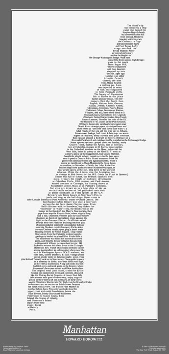
John Krygier posted and interesting article on Typography maps. Although he states that this map was printed by error, sans political boundaries, it is still an interesting map on its own, and a great idea. This article also includes the previously mentioned Manhattan Wordmap.
Friday, June 24, 2011
Interborough Rapid Transit Company (IRT, Now part of the MTA of NYC)

http://www.nycsubway.org/
Subway maps are one of my favorite things. Especially reading up on the evolution of the lines, how they came to what they are today, and all the changes that happen on a regular basis. While some systems don't change too often, NYC seems to be notorious for changing train routes. Forgotten-ny is one site I've spent countless hours browsing, as there are so many interesting pages to browse. The NYC transit system has changed so much since its creation (previously two separately created private systems, IRT and BRT) that there is actually a single-track platform under Times Square that no one knows what it was even used for (information found in Subwayland).
Thursday, June 23, 2011

Subscribe to:
Comments (Atom)