Map Storage, c{Art}ography, Mapping Designs and Ideas
Wednesday, July 20, 2011
Africa in Perspective
As we all know, maps lie. As the United States has adopted the Mercator Projection as its standard in classrooms, many people have been falsly informed on the "true" sizes of our physical landscapes. The worst on the map being that Greenland is represented as being approximately the same size as Africa, when it fact is shares a square area closer to the size of Mexico.The map above really gives you a good idea of how large the continent of Africa really is.
Wednesday, July 13, 2011
Tuesday, July 12, 2011
LGTBI Rights Map - 2008
This is an interesting map I came across showing the progression for the rights of Lesbian, Gay, Transgendered, Bisexual and Intersex people's right. We can now add a red New York State to this map as well.
Monday, July 11, 2011
Saturday, July 9, 2011
World Transit System
If only traveling could be this easy...
This map follows Harry Beck's topological design and closely resembles the London Tube Map, Circle Line included. As with any Harry Beck-like map, this map is a representation of relativity. Don't take your geography lessons from this map! Most of these cities are fairly off from where they actually are.
Friday, July 8, 2011
The Hitchhiker's Map
This was an interesting map I recently came across. I don't know where its from as it had no source, nor do I trust its validity (for example, I am aware that hitchhiking in Japan is immensely popular and one of the safest places in the world to do it in), however, it is a neat concept
Little Italy, Literally
So I know this isn't really a map, or at least not a traditional kind. But hey, someone still had to design and create this landscape which in the end is a representation of a map.
Wednesday, July 6, 2011
Swear Map
This was an interesting map I came by produced by Daniel Huffman. He produced this map by creating a raster layer (interpolation) from the original data so that each pixel would be assigned a specific value as opposed to representing the data as points.
Tuesday, July 5, 2011
The Upside Down Map
The famous upside down world map. People have suggested that the power balance between countries would be much different today if the world had been drawn "upside down". What is right side up and upside down anyway when the universe is infinite and directionless? The world could have easily be drawn this way when first cartographic maps were being produced. Note how the the US and Western Europe seem so small and almost virtually lost in this map.
Sunday, July 3, 2011
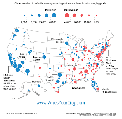
The Singles Map
A few years back, I had done some internship work with Prof. Richard Florida's team for one of his publications entitled "Who's Your City?" Although I did not create this map, this map was definitely the one that sparked the most interest when introducing our topic to our supervisors.
Saturday, July 2, 2011
Fictional Map Maker
Shane Watt is an artist and a musician from Montreal who is growing in fame for his fictional maps. After learning about his maps I felt inspired to try my own. But let's face it, I am no artist with a pen or pencil, but only with a mouse. Shane Watt is a self-taught cartographer who regularly commissions maps for his fans and followers, as well as having being featured in galleries in Montreal, London, and New York City to name a few. Check out his portfolio or his Facebook page.
Friday, July 1, 2011
The Lost Rivers of Montreal - 1542-1642
Almost all, if not all of these rivers, have disappeared from the Island of Montreal's Landscape. They have mainly been channeled into sewers and collectors and much of the city sits on top of them. We walk, drive, and bike over these everyday without even knowing they exist, or ever existed for that matter. Check out Under Montreal, a great blog with tons of information on what's been lost on the Island
Subscribe to:
Comments (Atom)


